[History by Numbers] Flo charts
On Florence Nightingale's overlooked contribution to the field of medical statistics
This is the first in a new series of articles here about British history and how it can be explored through statistics and ‘big data’. After this article these will only be available to paying subscribers. Until 31 March 2023 you can subscribe for 33% off! (The regular Histories articles will continue to be free.)
The popular image of Florence Nightingale is of ‘the lady with the lamp’, tending to wounded soldiers from the Crimean War. In the gushing words of a contemporary issue of The Times, “she is a ‘ministering angel’ without any exaggeration in these hospitals, and as her slender form glides quietly along each corridor, every poor fellow’s face softens with gratitude at the sight of her”.
Her subsequent role as a champion of the nursing profession, author of a key textbook and ardent supporter of proper training, is also well known enough – but it could be argued that some of her greatest influence has been in the field of statistics.
According to biographer Mark Bostridge (in Florence Nightingale: The Woman and Her Legend), Florence, named after the Italian city where she was born in 1820, had grown up in a family comfortable with mathematics. She was tutored by her father in the subject, as well as her cousin Henry Nicholson, who studied it at Cambridge. Later in life, she became the first female member of the Royal Statistical Society.
After the Crimean War, Florence decided to use her talent for maths and knowledge of methods of representing statistics in graphical form (such as the pie chart, developed by William Playfair in 1801) to show how improvements in hygiene could save lives. In her report to the Royal Commission on the Health of the Army (1857) she used a variety of tables and a new type of chart she called a ‘bat’s wing’ to show how the work of the government’s Sanitary Commission had dramatically reduced the numbers of deaths. You can explore many of these charts in a reprint of her report, Mortality of the British Army, available online at www.archive.org/stream/mortalityofbriti00lond.
Another of her biographers, Hugh Small (author of Florence Nightingale: Avenging Angel), draws particular attention to a bar chart she created which clearly demonstrated how soldiers in barracks back in England died at a faster rate than civilians living in the same towns – the conclusion being that the nature of the building where people lived could significantly impact hygiene and therefore health. Small notes an aspect of her diagram which reminds us of the ‘thin red line’ of men at the Battle of Balaclava: “The thin red lines on Nightingale’s chart represented these same heroic soldiers who were now dying unnecessarily because of bad hygiene in their barracks.”
The implications of this chart also extended to the idea that civilian hygiene could also be improved by changes to people’s living conditions.
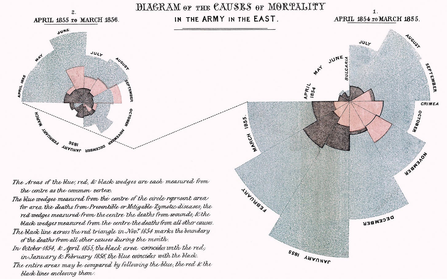
Today Florence is also credited with the invention of a particular type of ‘polar area diagram’, also known as the Nightingale rose diagram. Florence first used this to illustrate seasonal variations in the causes of patient mortality in her field hospital (see illustration above).
In this chart, Florence used areas to show this variation, and different colours to show the causes: blue for death by sickness, red for wounds and black for other causes. The point was how much larger the blue areas were than the red ones.
In her essay ‘Florence Nightingale’s Statistical Table for Hospitals’ (in Visible Numbers: Essays on the History of Statistical Graphics), Professor Lee Brasseur observes: “Nightingale’s skill at turning tabular data into data visualisation resulted in real change for injured and ill soldiers.” She also points out that another major achievement by Florence was her use of a sophisticated chart for recording data as well as for displaying it. This was the ‘Hospital General Statistical Form’, which Brasseur describes as “a tabular form that doctors and nurses could fill out in order to understand frequencies and patterns of diseases and injuries”.
In Florence’s own words (when she presented it to the Royal Statistical Congress):
“Each table is divided vertically into columns containing the ages [of patients] in monthly and yearly periods… The disease list is divided into two sections, one printed on the left hand, the other on the right of the sheet. The left-hand division contains the diseases most frequently admitted into hospital; the right-hand the rarer forms of the disease.”
Florence even had this chart tested in three London hospitals in order to refine it before she publicly advocated its use. A form to fill in might seem trivial today, but our lives are dependent on this sort of data-gathering that we now take for granted. Brasseur cites the authors of one paper on Nightingale who wrote she “may well deserve the credit for the birth of evidence-based medicine”.
That’s a profound thought – the lady with the spreadsheet had an even bigger influence on the history of medicine that most of us may have realised.

